Record Сard Customization
The following extension points can be added to the record card:
New Item in Drop-down Menu
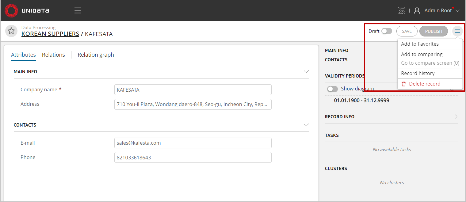
Figure 1. Drop-down menu
UEDataCardMenuItem accept an AbstractCardStore in the resolver, so that certain items can be added/excluded through the implementation of a specific class of card store.
UEDataCardMenuItem type
import {INamespaceDataRecord, UeModuleBase} from '@unidata/core-app';
import {ComponentType} from 'react';
import {AbstractCardStore} from '../../store';

type DataCardMenuProps<T extends INamespaceDataRecord> = {
dataCardStore: AbstractCardStore<T>;
}

export type UEDataCardMenuItem<T extends INamespaceDataRecord> = UeModuleBase & {
default: {
    component: ComponentType<DataCardMenuProps<T>>; // the component that will be rendered in place of the button.
    meta: {
    menuGroupId: string; // specifying a group to separate menu items
    };
    resolver: (dataCardStore: AbstractCardStore<T>) => boolean; // a function that determines in which case to show the button (depending on the state of the card)
};
}
Implementation example: “Record history”, which is displayed only in published records.
interface IProps {
    dataCardStore: DataCardStore;
}

export class HistoryMenuItem extends React.Component<IProps> {
    openHistoryPage = () => {
        const dataCardStore = this.props.dataCardStore;
        const etalonId = dataCardStore.etalonId;

        if (etalonId) {
            dataCardStore.routerStore.setRoute(RouteKeys.RecordHistoryPage, {
                namespace: dataCardStore.namespace,
                entityName: dataCardStore.typeName,
                etalonId: etalonId
            });
        }
    }

    override render () {
        return (
            <DropDown.Item onClick={this.openHistoryPage}>
                {i18n.t('module.data>history>recordHistory')}
            </DropDown.Item>
        );
    }
}

export const historyButtonUE = {
        'default': {
            type: UEList.DataCardMenuItem,
            moduleId: 'history',
            active: true,
            system: false,
            component: HistoryMenuItem,
            resolver: (dataCardStore: AbstractCardStore<any>) => {
                return dataCardStore instanceof DataCardStore &&
                    dataCardStore.draftStore?.draftId === undefined;
            },
            meta: {
                menuGroupId: DataCardMenuGroupName.history
            }
        }
    };
New Tab in Record Card
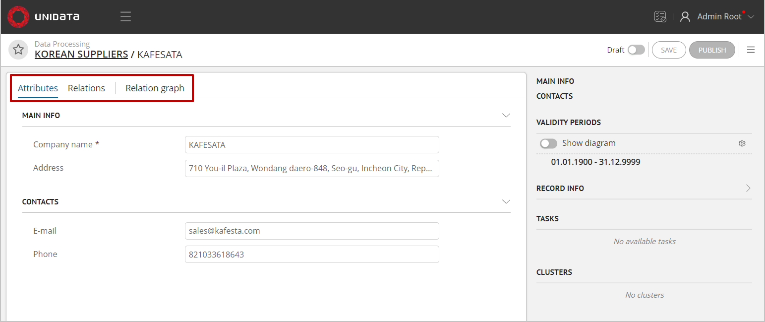
Figure 2. Tabs of record card
The current tabs of attributes, relations, etc. are bound to the DataCardStore in the resolver. If you inherit from AbstractCardStore, you need to prepare the tab content yourself.
UEDataCardTabItem type
type DataCardTabItemProps<T extends INamespaceDataRecord> = {
    dataCardStore: AbstractCardStore<T>;
}

export type UEDataCardTabItem<T extends INamespaceDataRecord> = UeModuleBase & {
    default: {
        component: ComponentType<DataCardTabItemProps<T>>; // the component that renders the contents of the tab
        meta: {
            tab: TabItem; // tab description (display name, key, etc.)
            position: 'left' | 'right'; // the ability to add tabs both to the general list and on the right side of the card
        };
        resolver: (dataCardStore: AbstractCardStore<T>) => boolean; // a function that determines in which case to show the button (depending on the state of the card)
    };
}
Implementation example:
export const relationGraphUE: UEDataCardTabItem<DataRecord> = {
    'default': {
        type: UEList.DataCardTabItem,
        moduleId: 'relationGraph',
        active: true,
        system: false,

        component: RelationGraphTabItem, // component that renders relations graph
        meta: {
            tab: {
                key: 'relationGraph',
                tab: i18n.t('module.data-ee>ue>relationGraph>tabLabel'),
                order: 30
            },
            position: 'left'
        },
        resolver: (dataCardStore: AbstractCardStore<DataRecord>) => {
            return dataCardStore instanceof DataCardStore &&
                MetaTypeGuards.isEntity(dataCardStore.metaRecordStore.getMetaEntity()) && Boolean(dataCardStore.etalonId) &&
                dataCardStore.draftStore?.draftId === undefined;
        }
    }
};
New Content on Right Sidebar
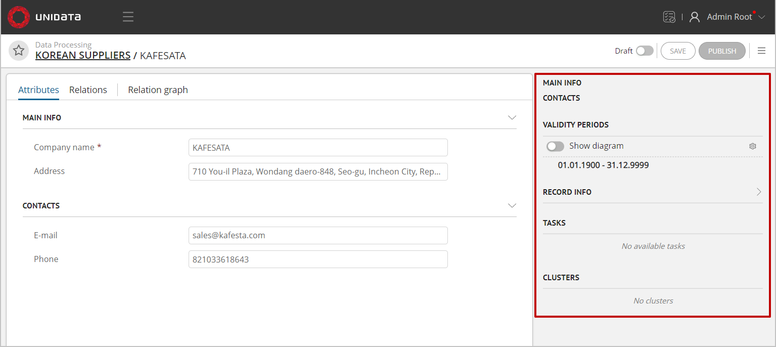
Figure 3. Right sidebar
Validity periods, Clusters, Tasks are User Exits of UEDataCardSidePanelItem type.
At the moment they are not bound to the store type and will be available for all possible cards. This behavior can be changed according to project requirements.
UEDataCardSidePanelItem type
type DataCardSidePanelItemProps<T extends INamespaceDataRecord> = {
    dataCardStore: AbstractCardStore<T>;
}

export type UEDataCardSidePanelItem<T extends INamespaceDataRecord> = UeModuleBase & {
    default: {
        component: ComponentType<DataCardSidePanelItemProps<T>>; // The component that renders the contents of the panel
        meta: {
            order: number; // panel sequence
        };
        resolver: (dataCardStore: AbstractCardStore<T>) => boolean; // a function that determines in which case to show the button (depending on the state of the card)
    };
}
Implementation example:
export const clusterWidgetUE: UEDataCardSidePanelItem<any> = {
    'default': {
        type: UEList.DataCardSidePanelItem,
        moduleId: 'dataRecordClusters',
        active: true,
        system: false,
        component: ClustersWidget, // panel content component
        resolver: (dataCardStore: AbstractCardStore<any>) => {
            return Boolean(dataCardStore.etalonId); // display only if there is an EtalonId of the record
        },
        meta: {
            order: 20
        }
    }
};
Attribute Display in Record Card
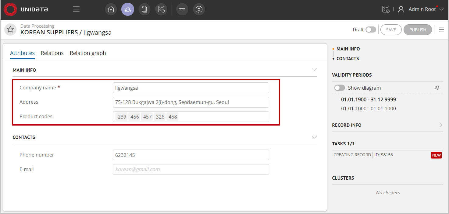
Figure 4. Displaying of simple and array attributes
The UEAttributePreview user exit is responsible for displaying the attributes in the record card (Figure 4).
Examples of implementations can be found by following links: preview of simple and array attributes.
UEAttributePreview type
import {INamespaceMetaModel, UeModuleBase} from '@unidata/core-app';
import {ComponentType} from 'react';
import {AbstractAttribute, UPathMetaStore} from '@unidata/meta';
import {AbstractModel} from '@unidata/core';
import {ArrayAttributeStore} from '../../page/dataview_light/dataviewer/card/attribute/store/ArrayAttributeStore';
import {SimpleAttributeStore} from '../../page/dataview_light/dataviewer/card/attribute/store/SimpleAttributeStore';
import {AbstractDataEntityStore} from '../../page/dataview_light/store/dataEntity/AbstractDataEntityStore';

type AttributePreviewProps = {
    attributeStore: SimpleAttributeStore | ArrayAttributeStore;
    dataEntityStore: AbstractDataEntityStore;
    metaEntityStore: UPathMetaStore<INamespaceMetaModel>;
}

export type UEAttributePreview = UeModuleBase & {
    default: {
        component: ComponentType<AttributePreviewProps>;
        meta: {
            name: string;
            displayName: () => string;
        };
        resolver: (attribute: AbstractAttribute, model: AbstractModel) => boolean;
    };
}